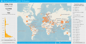
WHO Situation Dashboard
Here are some of the best maps tracking Coronavirus updates
This is a developing story and we will continue to add more interesting maps to the existing list. Last updated on March 23.
Since the first case of COVID-19 was identified in Wuhan, China in December 2019, the disease has spread across the world, affecting over 200,000 people in 166 countries and more than 8,700 deaths. The World Health Organization called it a pandemic on March 11, 2020. Below are some of the best maps tracking the spread of Coronavirus.
WHO Situation Dashboard
 World Health Organization’s Situation Dashboard provide the latest updates on the novel coronavirus outbreak. These include updated numbers of infected people, deaths, affected countries and other related data regarding the COVID-19 outbreak. Built on an ArcGIS platform, this dashboard could be considered to be the most authentic source when it comes to the statistics since the data source is from WHO. However, it should be noted that the WHO reported case numbers are conservative, and likely represent an undercount of the true number of coronavirus cases, especially in China.