Wohan Virus Map
This Map is Tracking the Novel Coronavirus (COVID-19) in Near-Realtime
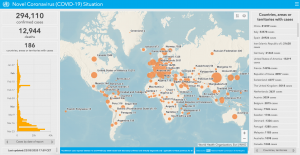
As new cases of the Novel Coronavirus (now officially known as COVID-19) are reported, an interactive map developed by Johns Hopkins University (JHU) is providing near real-time tracking. Built as an ArcGIS dashboard, the map pulls in information from a wide range of sources to be able to provide twice daily updates.
Where is the Data About Novel Coronavirus Cases Coming From?
As reports of new cases come in, the map updates by aggregating reporting from various government and health sources. The coronavirus mapping originally started with sources of confirmed COVID-19 cases from WHO, U.S. CDC, ECDC China CDC (CCDC), NHC, and Dingxiangyuan (an aggregator site for health cases). As the virus spread to other countries, the collection of data has expanded to: WHO, CDC, ECDC, NHC, DXY, 1point3acres, Worldometers.info, BNO, state and national government health department, and local media reports. Keep in mind that the total number of cases is for known (confirmed and presumptive positive) cases of coronavirus. Testing levels have been uneven with some countries testing at a much higher rate than other countries.
These reports of new Coronavirus cases are geocoded by city or place so they can be displayed on the map. The aggregated data can also be downloaded for those that want to directly access the novel Coronavirus data (more on where to download the virus data below).
How the Coronavirus Data is Mapped
All data is displayed as a graduated circled. This means that the size of the circle is based on the total number of reported coronavirus cases. The higher the total number of confirmed and presumptive positive cases a geographic location has, the larger the circle. Users can see what the different categories are for sizing the circles by clicking on the legend icon in the upper-right corner of the map.

The coronavirus data is mapped by geocoding at the smallest geographic level available. This can vary greatly by country from mapping at the country level to mapping COVID-19 cases at the county level. The level of spatial detail varies depending on the country of origin that is reporting the cases. Since the data is displayed as a geocoded point, the location of the circular symbol is located in the center of the geographic area it represents. In China, the number of reported, recovered, and deaths is displayed at the province level. Therefore the graduated symbols are placed in the center of each province.

For most of the countries, the confirmed and presumptive positive coronavirus case numbers are geocoded to the country level. Therefore, the graduated symbol is placed in the middle of each country’s boundary.

Reported coronavirus cases for the United States are geocoded at the county level. Of all the countries being mapped by Johns Hopkins University, the United States is being geocoded at a higher spatial higher resolution. Users can click on a graduated symbol and see coronavirus case information being reported at the county level.

How To Access the Map of Coronavirus COVID-19 Cases
To see the map of near-realtime confirmed COVID-19 (novel coronavirus) cases visit:
If you’re visiting from a mobile device:
Ad:

Malware Masquerading as the Coronavirus Map
Update March11, 2020: Users looking for JHU’s coronavirus map need to be aware of recent threat reports about malware pretending to be a coronavirus map that tricks users into downloading malware. The map created by JHU is, and has always been, safe from malware. Users should never download an app or .exe to use JHU’s website. More: Beware of ‘Coronavirus Maps’ – It’s a malware infecting PCs to steal passwords
Statistics About the Novel Coronavirus
The GIS dashboard contains a comprehensive overview of how the Novel Coronavirus is spreading day-by-day. On the top left is the total number of confirmed cases as of the last update (the Novel Coronavirus map is updated twice a day). The box below that show a list of the cases by countries and administrative units. Click on any of the locations on that list to have the map pan to that region. The graph below that shows how the spread of the virus is skyrocketing with the total cases in China. Hover over each point on the graph to see the number of confirmed cases being report for both China and other locations.
Mapping the Novel Coronavirus
The middle of the GIS dashboard is dedicated to a global map showing all reported COVID-19 cases by location. Click on any location of novel coronavirus cases on the map and a pop-up will display information about the cases being reported there. The boxes on the right side display summary information about total deaths and recoveries as well as location-by-location detail about cases.


